top of page
Artifact 10: Visualizing Data
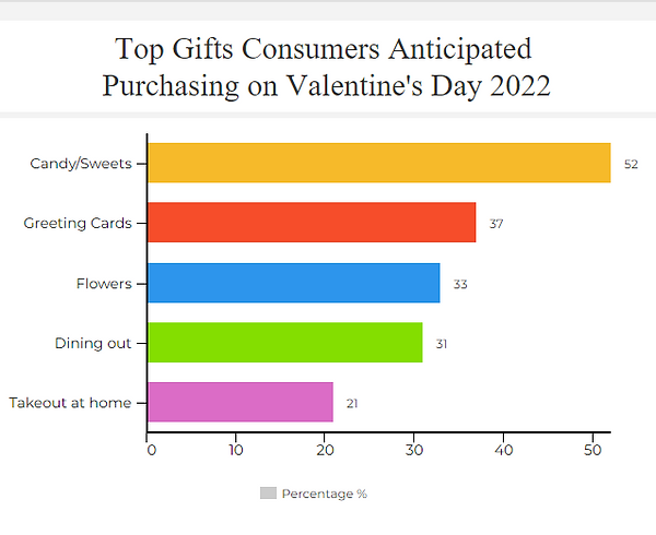
I selected this data because I was curious to see what kind of data could be found about the holiday of Valentine's day. I used Vengage Graph Maker to create the graph, took a screenshot, and added a link to the graph in the image.
The Graph Maker allowed me to fill out a data table and adjust the colors and design of the bar graph for it to turn out this way. Although I used colors, I also made sure to add text to the axis to help viewers still be able to decipher the graph. While creating this graph, I learned that you can make different kinds of edits to a simple bar graph to make it more appealing as well as viewable.
bottom of page